Quick and Dirty tips
Quick and Dirty tips
When you first want to use python for any sort of physics problem it will probably fall under one of these three categories:
Calculating a value (e.g Integral) from a set of data.
Fitting data to a curve.
Plotting a visualization of the data you have.
You’ve probably done some plotting in something like excel or google sheets before and it is a quick and easy way to do that. However, python has an extensive library of tools that make your visualizations much more appealing.
The amount of tools might seem daunting at first, so this section is going to be concerned with how to use these tools and not with how they work. We will also offer a quick template into which you can copy your own (x,y) data into and it will do some basic visualization of it.
If you were introduced to python in a class you will probably have heard or seen people use a “Jupyter Notebook”. This is basically a tool that allows you to run python code inside of “cells” instead of having to write a script and run it from you command line. It is a very convenient tool and will basically cover all your needs unless you decide to dive a lot deeper into programming.
Let’s start with a basic problem. You have some \(x\) and \(y\) data and you want to plot it to see how it looks. For that you need 1 maybe 2 things at most. First you need to import the libraries you want to use. These are essentially extensions to the barebones python that you have and allow to simply tell it to do things instead of writing all the procedures from scratch. So to start we need to import the plotting library (matplotlib)
import matplotlib.pyplot as plt
Don’t worry much about the pyplot part. All you need to know for now is that you have imported your plotting library. This contains all the tools you need to plot. And by saying as plt you have essentially told your notebook that instead of always writing matplotlib.pyplot everytime you want to use it you will simply write plt.
Now let’s do a quick example to show what functionalities we have uncovered with this one line of code. Let’s say you have the following \(x\) and \(y\) data. \(x:{0,1,2,3,4,5}\) and \(y:{3,4,5,6,7}\) These are the data points \((x,y)\) you want to plot. So there are a few steps you need to do: the first is to tell your notebook what your data is:
x = [0, 1, 2, 3, 4, 5]
y = [3, 4, 5, 6, 7, 8]
Notice that in python when you want to give a collection of data you have to surround it with square brackets ‘[.]’ and separate the data by commas ‘,’. What we have created here are called lists, but for now you don’t need to know more about what they are. To plot this all you have to do is the following:
plt.plot(x, y)
And this is what you will see.
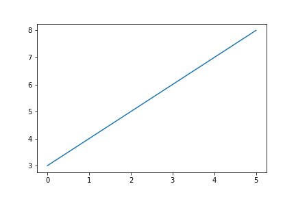
As you may have noticed this is pretty barebones so we can add a few lines of code to make it look somewhat more presentable.
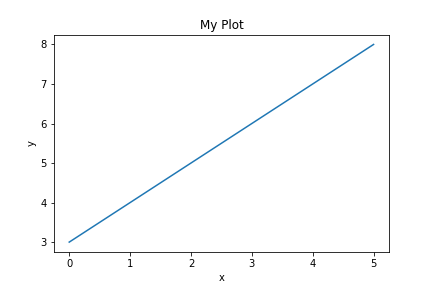
plt.plot(x, y)
plt.xlabel('x')
plt.ylabel('y')
plt.title('My Plot')
Now we have labels on our axis and a title.
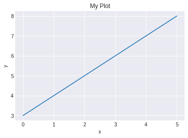
However it could just look prettier overall. There are a lot of parameters one could tweak but the easiest and quickest way to do this is to set the style as such
plt.style.use('seaborn-darkgrid')
plt.plot(x, y)
plt.xlabel('x')
plt.ylabel('y')
plt.title('My Plot')